

iTamtam M1 iPod Docking Stool


Tilt-shift photography actually refers to the use of camera movements on small- and medium-format cameras, and sometimes specifically refers to the use of tilt for selective focus, often for simulating a miniature scene (-wikipedia). Viewing this type of photos gives you a feeling you looking at a miniature of something like a scenery, for example,or an aerial view of a city.
There are two ways to achieve this effect. One is by producing it optically using tilt-shift lens. The other way to do this is by using post processing image software by simulating shallow depth of field. To produce tilt-shift photographs optically, there are two basic movements involved–first is the rotation of the lens plane relative to the image plane, called tilt, and second is the movement of the lens parallel to the image plane, called shift. Photographers use the tilt movement to control the orientation of the plane of focus, making specific parts of an image to appear sharp. Shift, on the other hand, is used to adjust the position of the subject in the image area without moving the camera back, avoiding the convergence of parallel lines such as in photographing tall buildings.
To give you an idea of what we are talking about here, we decided to pool together 30 amazing examples of tilt-shift pictures produced either optically (using tilt-shift lens) or through digital processing. Links below each image is provided so you can check out the high-quality versions of this photographs. We also encourage to view similar creations from these photographers.
01-The Little Things

World Cup 2010 is set to start in just a few hours! I am sure millions of football fans out there are overly excited and at the same time impatient for the event to start. The 2010 World Cup, which is being held in South Africa between 11 June and 11 July 2010 is is the 19th World Cup and it involves 32 teams competing for the title.
To celebrate this unfolding history, we decided to come up with a huge compilation of high-resolution desktop wallpapers commemorating the event. Some of these wallpapers have various versions featuring different country teams while some are featuring popular football star players. There are also wallpapers featuring FIFA 2010 Official mascot Zakumi, who is described as a jolly, self-confident, adventurous, spontaneous, and actually quite shrewd little fellow. So to all football fans out there, grab your World Cup 2010 wallpaper now and start displaying one to feel the fever of the 2010 Fifa World Cup! Remember, this happens once every four years only. To download each design, just click on the link found below each preview image and choose the right size of the wallpaper for your desktop. Have fun and enjoy!
#1-FIFA World Cup 2010 Mascot Wallpaper (Green)

Wine packaging design plays a major role in wine branding. Especially when a new wine is being introduced to the market, the label design can in fact, make or break the success of the brand. No matter how excellent the quality of the wine itself, the packaging design is the first thing that customers see and become the basis of most customers when deciding to buy the wine or not. Thus, the work of a graphic designer is very crucial to the success of a a wine brand. To make a brand stand out, many designers have come up with unique and creative wine packaging designs. In this roundup, we gather 26 unusual wine packaging designs where you can draw inspiration from. To know more about each design and view more and enlarged pictures, just click on the link found below each preview image.
Wine Packaging 01-Honeymoon by Lauren Golem
Honey Moon is a promotional wine bottle that would be sent out for the first day of summer. The concept is based on the the first full moon in June, which occurs near the first day of summer. It is seen as the most optimal time to harvest honey and thus, called the honey moon. The bottle would be sent to new clients, as we start our honeymoon for our sweet new business relationship. I also developed the typeface that was used for the logo.
01- Fuelhaus business cards
Unique and capable of lighting you on fire.
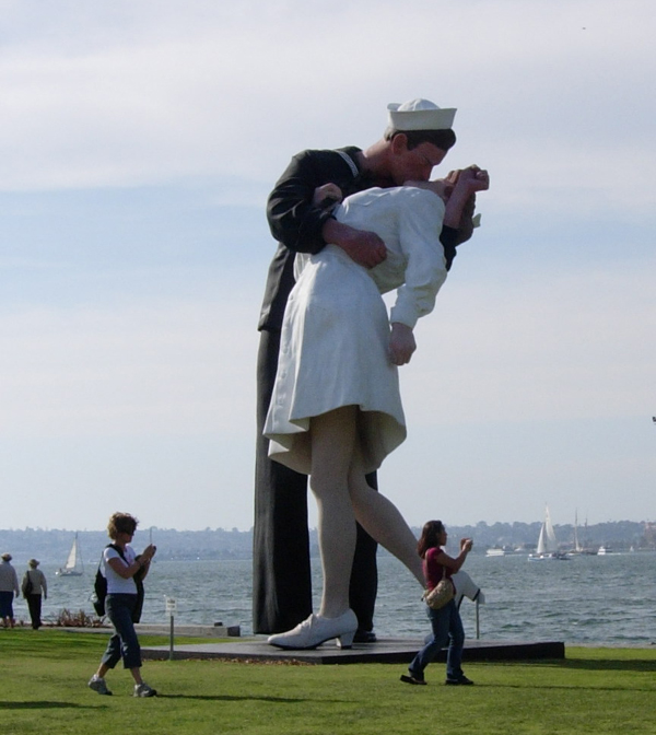
Kissing is one of the most pleasing moments someone can find themselves in. The kissing process can go in many different directions, so knowing what to do is very important. When you are in a loving relationship, sharing a passionate kiss with your partner is just about the best feeling in the world. When that special kiss takes place, you find your emotions and thoughts in a whole new part of your mind. Lets take a look at some kissing sculptures which are looking really awesome.
One needs plenty of ideas, creative juices and inspiration when designing a business card. As graphic designer, you need to consider so many things before you can come up with a concept. With a limited space, the challenge to design a business card that speaks of the product or services that it is promoting. In this post, we gathered together what we think are the most creative business card designs released from January-July 2010. If you have a personal favorite that is not included in this list, please feel free to post the link in the comments field below. I hope you also find these business cards inspiring as well.
01-Wooden Business Card by Sam Gough

1. We evolve hotter.
A recent study revealed that women are getting better looking through evolution; meanwhile, men are staying the same. After following more than 2,000 people through four decades of life, the study showed that attractive women had 16 percent more children than average-looking chicks and that beautiful people are 36 percent more likely to have a daughter as their firstborn. All those gorgeous daughters mean more beautiful women than in past generations.

While surfing through the web for my today’s post I saw this article on COSMOPOLITAN, found it interesting, so decided to share with you.Tons of recent studies proving that women have some amazing abilities that men lack. We have listed ten of our favorites.
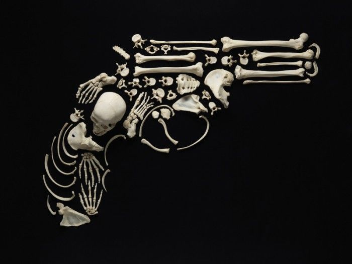
“Stop The Violence” is the artwork done by a talented artist Francois Robert. According to Francois, he purchased a human skeleton in the mid-90′s during an auction from an old school. In 2007, as the recession began to think its teeth into the economy, Mr. Robert had so much time on his hands that he decided to turn to the skeleton in his closet. Because its parts were wired together, for educational purposes, the artist decided he needed one that could be broken down into pieces. So he traded his skeleton, for a box filled with 206 real human bones. Since then, Francois Robert has been spending most of his days, on his knees, arranging even the tiniest bones into the right position, for the perfect shot.
12 photos
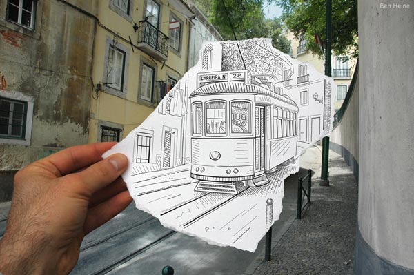
27 Photos


 [
[