I don`t know when and where I toked this photos and who are in these shadows.
On the shadows don`t understand what are they portrait.
Who have in they ayes have sorrow ... who have happiness.
Special thanks to my Friend MANA N
This is one blog about fun in world. In here you can see fun video,image,flash site,game and ...
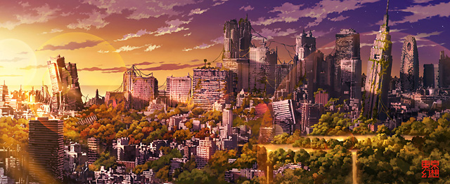
The illustrations of TokyoGenso (a.k.a. Tokyo Fantasy) depict a post-apocalyptic Tokyo devoid of people and overtaken by nature.

Shinjuku skyline [+]


Staircases can be so much more than just a means of getting to the next floor. A staircase can be a work of art, a conversation piece, a place to meditate, or a historical marker.

This floating staircase by designer Jordi Vayreda looks dangerous, but the steps are made of steel welded to a thick beam inside the wall. The top of the wall can be used as a handrail for the upper half of the staircase. See more pictures and an explanation here.
Few weeks ago we made a post on amazing street arts for ABS4FuN, which got lots of response from our visitors. There were varieties of responses; some appreciated the post and some showed their doubt on those realistic street arts. It is true that, some of arts were really unbelievable to trust.
Now in this time, we came again with some new unbelievable realistic street arts which are also called pavement art. This time you will get some source links with the image. Hope you will enjoy this second part of amazing street arts like previous.
In here you can see some sentences of popular people before they die


For over 15 years, Vincent Dixon has produced award winning images and helped to create many memorable advertising campaigns. He was born in Kilkenny, Ireland and, despite earning a PHD in molecular biology, he eventually found his true calling behind the lens. Vincent started his professional career in Paris and quickly was awarded some of the top campaigns in Europe such as Absolut Europe and Perrier. Those highly visible campaigns, among others, quickly gained him notoriety throughout both Europe and North America.
There are those who will throw away their old record covers but there are those that will use them to create some mind blowing artistic stuff. One of them is definitely Christian Marclay, a New York visual artist, DJ and composer who used record covers of Michael Jackson , Doors, Donna Summer, David Bowie and many others for this piece of art. The relationship of sound, vision, music, art and performance is the focus of his work.


you will definitely like this one if you already liked our other posts .
This time there has been added an ironic and unrealistic touch to the pictures.
The Russian advertising company “Good” has created this funny ad showing different helmet designs, like for example diamonds, a globe, different kinds of balls and even body parts. Imagine how cool it would be if someone really produced helmets like these.
The same company has also printed a set of interesting images on ping pong rackets. Another fun advertisement is the one that is representing lego blocks with meaningful shadows.
1. Windsor Castle, in Berkshire, England
Windsor Castle, in Berkshire, England, is the largest inhabited castle in the world. It is one of the official residences of The Queen, together with Buckingham Palace in London and Holyrood Palace in Edinburgh.
10. A goat can rock an emo haircut and be cool. So what, goats can listen to emo rock and have cool profile pictures on myspace, can’t they?
Reflection photography can be explored on easily available like mirror, reflective surface and also water. You have to dig deeper into your imagination to see the beauty from that kind of photography. It is also a scientific art because you should know the techniques and must be popular with your camera to take perfect shot. For perfect reflection photography you must have skills that made you different. Creativity and quality of photos depend on the photographer. Lets take a look at some excellent examples of reflection photography done by various creative photographers.
25 photos
We love Photoshop because it’s one of the most useful images-editing applications for both web and print designs. With some fair amount of knowledge, you can manipulate any photo and turn them into anything you want.

However when Photoshop falls in the hand of careless designers, poor jobs are created. Obvious flaws are missed and when designs are printed it leads to laughter and sometimes embarrassments. In today’s article, we’d like to show you the worst of Photoshop flaws in magazines, things that slipped editors’ eyes. The next time you flipped through a magazine, take a closer look, you might spot one if you are lucky.
 When it comes to web and graphic design, Adobe Illustrator is usually the primary option to consider. However, just like most other graphic design tools, it is easy to learn but extremely hard to master. Illustrator offers a variety of advanced tools to smooth out your design, optimize structure proportions and emphasize some beautiful details.
 If you have some experience with Illustrator then it is easy to learn the basics and quickly produce very impressive and beautiful results. With the help of Illustrator, we can create any type of stunning effects, especially related to typography.
We all know that Illustrator is the most powerful tools for creating vector graphics. Whether it is about designing icons or creating vector landscapes, illustrator is the boss. A true designer should master this vector tool and his/her skill set is defined by how avidly he/she can illustrate. We have seen so many inspirational illustrations from awesome artists.
In this article, I have rounded up some of the best Illustrator tutorials of all time. They include from creating simple text effects to the most advanced hand drawn elements. So, I think this ought to keep you busy for at least a month. Have fun and Good Luck!
Error messages are annoying and disturbing. When they prompted, that means our work for the entire night is screwed. They are frequent visitors particularly if you are Windows users. In fact, sometimes they showed up so frequent that we’ve got no choice but to live with it.

However, scratching your head over these pop-up error messages will not help either. To reduce the level of stress, creative designers decided to do something about these error pop-up windows. They edited the error messages and the interfaces to bring out the humor side of it.
Here’s a collection of 40+ funny and edited error messages for a good laugh. We’ve alsoincluded one ultimate (and real) error message at the end of this article. The next time you see an error message, just smile :)
Michael Jackson
We may have lost the King of Pop in the summer of 2009, but his music lives on, as does his likeness, now preserved in chicken wire.
Artist Ivan Lovatt makes remarkably lifelike sculptures of famous folks, icons and wildlife out of material so paltry it’s usually reserved for poultry – chicken wire.
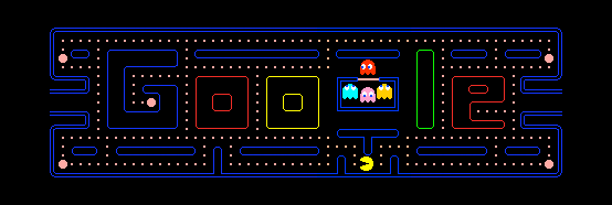
Google is celebrating 30th anniversary of PAC-MAN with a playable doodle on its home page. The doodle will be active for next 48 hours i.e. till 22 May midnight. To play the game, either you have to “Insert Coin” button, which replaces “I am feeling lucky” button or wait for few seconds until game automatically starts. To control the movement of Pac-man use the arrow keys.

If you press insert coin buttons twice, Ms. Pac-Man appears and you can control her by WASD keys. Arrow keys will still move Mr. Pac-Man.
You can also customize iGoogle with this Pac-man theme:http://www.google.com/ig/directory?type=themes&url=ighosting.googlecode.com/svn/trunk/xml/game_pacman.xml
Japaese video game designer Tōru Iwatani for Namco made Pac-Man on May 22, 1980. The highest score ever achieved is 3,333,360 by Billy Mitchel from Hollywood, Florida. (more)
Google’s senior UX designer and developer, Marcin Wichary says on this occation – “PAC-MAN seems like a natural fit for the Google homepage. They’re both deceptively straightforward, carefully hiding their complexity under the hood. There’s a light-hearted, human touch to both of them. And we can only hope you find using Google at least a quarter as enjoyable as eating dots and chasing ghosts. You know, without actually needing any quarters.”
Get from: Gtricks

Sex sells claims the old and undeniably true adage. We are sexual beings. Advertisers use this attribute by trying to associate their products and services with sexy imagery hoping that some of the hotness gets attached to their brand in the consumer's subconscious mind.
However abusing your audience's attention is a dangerous thing. Showing skin to get attention and then trying to sell completely unrelated products like hearing aides, touch-typing courses or car-rental rental services (like you will see below) may backfire. The reader feels cheated and talked down to. Another thing to be cautious about is how much nudity is sufficient to grab eyeballs and what is too much thus considered offending. This is of course a cultural question. Usually the more religious your target market the less accepted it is to show bare body parts. For these reasons one needs to be careful where and how to use sex in advertising.
Yet there are many brands that are brave enough to take the risk and celebrate sex as any other source of joy in life in their ads. Decide what works and what not for you and presumably for the target within this pool of several dozen campaigns collected over the last few years. Check out first the print advertisements by category then see a few links to sexy microsites and tv ads. Also watch a compilation of these ads in this video on YouTube.
If you had fun watching Creative Traffic Lights and Funny Stop Signs, you will definitely love the new ones he has made. The new signs are placed in several cities like New York, Los Angeles, Miami, Atlanta, etc., and they are still funny like all of TrustoCorp’s work. .
You will see signs saying “I’m not loving it” in front of Mc Donald’s, “Let’s go eat sushi and not pay for it” with a ski mask, “You look fabulous” with a female thumb up, and many more. They are clever signs that is highlighting the hypocrisy of human behavior by using sarcasm, so watch out for them on you way home after work or school, maybe you will spot one.
If you liked street art, you should take a look at these unique drawings made by only using shadows and spray painting. This artist has painted everything from snakes to owls.
Mark Mawson from Sydney captures these beautiful shots by dropping paint in water. The colors and the lighting are simply amazing! Author said that in these color shapes everyone sees what they want to see.
The Malaysian artist Chow Hon Lam has made some very funny but clever illustrations that also includes a touch of irony. The artist himself thinks that even if you are an animal, an object or some sort of food, you have something to say even though you can’t speak. Therefore Hon Lam wants to create and tell their story to the worldWhen people confront him about it, he just say: “I guess they must have something to say … Trust me, I try to communicate with them!” In the illustrations you can see how a the milk in a cow’s body is emptying itself while milking, gingerbread men creating themselves, a golfer breaking the sky with his golfball, etc.

Jason Heller is a commercial and wildlife photographer based in New York City.Jason can be best described as a conceptual commercial photographer specializing in underwater, travel & lifestyle photography, but the depth and breadth of his work both in and out of the studio has no bounds.

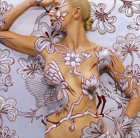
Emma Hack is a woman of many amazing talents, a combination sculptor, photographer, painter and illustrator who has combined her skills to create a stunning series of photographs featuring the beauty, fragility and adaptability of the female form.
Vintage design is always described as outdated, old looking design with most updated products like Facebook or Nintendo Wii featured… what?

Yeah it’s not a typo, I mean it, and you’re gonna witness 24 modern products adapted into vintage style advertisement. Some of them are created by modern designer, yet others are modified directly from genuine vintage ads originated from your parent’s era.
So get amused, get inspired, who knows vintage might be the design direction for your next viral ad campaign!

For over 15 years, Vincent Dixon has produced award winning images and helped to create many memorable advertising campaigns. He was born in Kilkenny, Ireland and, despite earning a PHD in molecular biology, he eventually found his true calling behind the lens. Vincent started his professional career in Paris and quickly was awarded some of the top campaigns in Europe such as Absolut Europe and Perrier. Those highly visible campaigns, among others, quickly gained him notoriety throughout both Europe and North America.

In the world of today, there are many diverse meanings to the word “painting”. Needless to say, there are also loads of coloring compounds that someone can utilize; depending upon the particular art form that they are creating. Body painting is one of the most famous forms of sketching that has become popular in the past few years. Let’s take a look at these fabulous hand painting art by Mario Mariotti an Italian artist from Florence.
35 Photos
Everyone has the right to create their own identity but in this case it’s more a matter of showing your inner darkness. These guys just don’t know what good taste is. Even though goth is popular among demented kids these goths are truly one of a kind. They must have had some trauma in their childhood that led them to behave and dress like dark lords. Don’t miss out on a a great laugh. Take a look.

Saudi Arabian versions of Mariah Carey’s album covers have been retouched to be less sexy. Some say it’s fake as the source of these pics is not clear and they could have been created by any photoshopper… So if you’ve got some info about these modified album covers, don’t hesitate to share it..

Here are some wornderful pencil art work done by Jennifer Maestre. Jannifer is doing pencil art for so many years but has shared her work first time.

Digital graffiti is the act of creating graffiti art using a computer vision system. With technological advancement, artists no longer need to go out the streets and paint the walls to express their creativity. Using advanced 3D and other image manipulation programs, artist can simulate street arts and post them online for people to view and appreciate them. In this post, you will 40 inspirational digital graffiti art work from various artists. Some of these artwork were intended as posters while some -can be used as desktop wallpapers. make sure to check out the other works of these artists. To view the larger version and know more about each graffiti artwork, just click on the preview image below.
Surreal photo is basically displays of a designer’s rich imagination of subjects which then injected into real pictures. Most of these surreal pictures are captivating be it pleasant or not because it is not what we experience in our daily life hence it is out of norm. Given it is not an event we could not possibly experience, it leaves a huge dimension for viewers to interpret what does the designer was trying to convey through their work. This is what makes surreal photos a challenge for the designers and in the same time, an awesome adventure for the viewers. Yes, all of that in a picture.

Today we have 40 manipulated surreal photos to share in this post. Hope it will manage pull you out of the box and have your head tilted figuring out these pictures.


Correct methods of working with computers


Exercises to improve and prevent carpal tunnel syndrome


You don`t think is better share with you friend and say to they are?